2 A Case Study
2.1 Introduction
k-means is an unsupervised machine learning algorithm used to find groups of observations (clusters) that share similar characteristics. What is the meaning of unsupervised learning? It means that the observations given in the data set are unlabeled, there is no outcome to be predicted. We are going to use a Wine data set to cluster different types of wines. This data set contains the results of a chemical analysis of wines grown in a specific area of Italy.
2.2 Loading data
First we need to load some libraries and read the data set.
# Load libraries
library(tidyverse)
library(corrplot)
library(gridExtra)
library(GGally)
library(knitr)

# Read the stats
wines <- read.csv("wine.csv")
We don’t need the Customer_Segment column. As we have said before, k-means is an unsupervised machine learning algorithm and works with unlabeled data.
Let’s get an idea of what we’re working with.
2.2.1 First rows
| Wine | Alcohol | Malic.acid | Ash | Acl | Mg | Phenols | Flavanoids | Nonflavanoid.phenols | Proanth | Color.int | Hue | OD |
|---|---|---|---|---|---|---|---|---|---|---|---|---|
| 1 | 14.23 | 1.71 | 2.43 | 15.6 | 127 | 2.80 | 3.06 | 0.28 | 2.29 | 5.64 | 1.04 | 3.92 |
| 1 | 13.20 | 1.78 | 2.14 | 11.2 | 100 | 2.65 | 2.76 | 0.26 | 1.28 | 4.38 | 1.05 | 3.40 |
| 1 | 13.16 | 2.36 | 2.67 | 18.6 | 101 | 2.80 | 3.24 | 0.30 | 2.81 | 5.68 | 1.03 | 3.17 |
| 1 | 14.37 | 1.95 | 2.50 | 16.8 | 113 | 3.85 | 3.49 | 0.24 | 2.18 | 7.80 | 0.86 | 3.45 |
| 1 | 13.24 | 2.59 | 2.87 | 21.0 | 118 | 2.80 | 2.69 | 0.39 | 1.82 | 4.32 | 1.04 | 2.93 |
| 1 | 14.20 | 1.76 | 2.45 | 15.2 | 112 | 3.27 | 3.39 | 0.34 | 1.97 | 6.75 | 1.05 | 2.85 |
2.2.2 Last rows
| Wine | Alcohol | Malic.acid | Ash | Acl | Mg | Phenols | Flavanoids | Nonflavanoid.phenols | Proanth | Color.int | Hue | OD | |
|---|---|---|---|---|---|---|---|---|---|---|---|---|---|
| 173 | 3 | 14.16 | 2.51 | 2.48 | 20.0 | 91 | 1.68 | 0.70 | 0.44 | 1.24 | 9.7 | 0.62 | 1.71 |
| 174 | 3 | 13.71 | 5.65 | 2.45 | 20.5 | 95 | 1.68 | 0.61 | 0.52 | 1.06 | 7.7 | 0.64 | 1.74 |
| 175 | 3 | 13.40 | 3.91 | 2.48 | 23.0 | 102 | 1.80 | 0.75 | 0.43 | 1.41 | 7.3 | 0.70 | 1.56 |
| 176 | 3 | 13.27 | 4.28 | 2.26 | 20.0 | 120 | 1.59 | 0.69 | 0.43 | 1.35 | 10.2 | 0.59 | 1.56 |
| 177 | 3 | 13.17 | 2.59 | 2.37 | 20.0 | 120 | 1.65 | 0.68 | 0.53 | 1.46 | 9.3 | 0.60 | 1.62 |
| 178 | 3 | 14.13 | 4.10 | 2.74 | 24.5 | 96 | 2.05 | 0.76 | 0.56 | 1.35 | 9.2 | 0.61 | 1.60 |
2.2.3 Summary
| Wine | Alcohol | Malic.acid | Ash | Acl | Mg | Phenols | Flavanoids | Nonflavanoid.phenols | Proanth | Color.int | Hue | OD | |
|---|---|---|---|---|---|---|---|---|---|---|---|---|---|
| Min. :1.000 | Min. :11.03 | Min. :0.740 | Min. :1.360 | Min. :10.60 | Min. : 70.00 | Min. :0.980 | Min. :0.340 | Min. :0.1300 | Min. :0.410 | Min. : 1.280 | Min. :0.4800 | Min. :1.270 | |
| 1st Qu.:1.000 | 1st Qu.:12.36 | 1st Qu.:1.603 | 1st Qu.:2.210 | 1st Qu.:17.20 | 1st Qu.: 88.00 | 1st Qu.:1.742 | 1st Qu.:1.205 | 1st Qu.:0.2700 | 1st Qu.:1.250 | 1st Qu.: 3.220 | 1st Qu.:0.7825 | 1st Qu.:1.938 | |
| Median :2.000 | Median :13.05 | Median :1.865 | Median :2.360 | Median :19.50 | Median : 98.00 | Median :2.355 | Median :2.135 | Median :0.3400 | Median :1.555 | Median : 4.690 | Median :0.9650 | Median :2.780 | |
| Mean :1.938 | Mean :13.00 | Mean :2.336 | Mean :2.367 | Mean :19.49 | Mean : 99.74 | Mean :2.295 | Mean :2.029 | Mean :0.3619 | Mean :1.591 | Mean : 5.058 | Mean :0.9574 | Mean :2.612 | |
| 3rd Qu.:3.000 | 3rd Qu.:13.68 | 3rd Qu.:3.083 | 3rd Qu.:2.558 | 3rd Qu.:21.50 | 3rd Qu.:107.00 | 3rd Qu.:2.800 | 3rd Qu.:2.875 | 3rd Qu.:0.4375 | 3rd Qu.:1.950 | 3rd Qu.: 6.200 | 3rd Qu.:1.1200 | 3rd Qu.:3.170 | |
| Max. :3.000 | Max. :14.83 | Max. :5.800 | Max. :3.230 | Max. :30.00 | Max. :162.00 | Max. :3.880 | Max. :5.080 | Max. :0.6600 | Max. :3.580 | Max. :13.000 | Max. :1.7100 | Max. :4.000 |
2.2.4 Structure
## 'data.frame':    178 obs. of  13 variables:
##  $ Wine                : int  1 1 1 1 1 1 1 1 1 1 ...
##  $ Alcohol             : num  14.2 13.2 13.2 14.4 13.2 ...
##  $ Malic.acid          : num  1.71 1.78 2.36 1.95 2.59 1.76 1.87 2.15 1.64 1.35 ...
##  $ Ash                 : num  2.43 2.14 2.67 2.5 2.87 2.45 2.45 2.61 2.17 2.27 ...
##  $ Acl                 : num  15.6 11.2 18.6 16.8 21 15.2 14.6 17.6 14 16 ...
##  $ Mg                  : int  127 100 101 113 118 112 96 121 97 98 ...
##  $ Phenols             : num  2.8 2.65 2.8 3.85 2.8 3.27 2.5 2.6 2.8 2.98 ...
##  $ Flavanoids          : num  3.06 2.76 3.24 3.49 2.69 3.39 2.52 2.51 2.98 3.15 ...
##  $ Nonflavanoid.phenols: num  0.28 0.26 0.3 0.24 0.39 0.34 0.3 0.31 0.29 0.22 ...
##  $ Proanth             : num  2.29 1.28 2.81 2.18 1.82 1.97 1.98 1.25 1.98 1.85 ...
##  $ Color.int           : num  5.64 4.38 5.68 7.8 4.32 6.75 5.25 5.05 5.2 7.22 ...
##  $ Hue                 : num  1.04 1.05 1.03 0.86 1.04 1.05 1.02 1.06 1.08 1.01 ...
##  $ OD                  : num  3.92 3.4 3.17 3.45 2.93 2.85 3.58 3.58 2.85 3.55 ...
2.3 Data analysis
First we have to explore and visualize the data.
# Histogram for each Attribute
wines %>%
  gather(Attributes, value, 1:13) %>%
  ggplot(aes(x=value, fill=Attributes)) +
  geom_histogram(colour="black", show.legend=FALSE) +
  facet_wrap(~Attributes, scales="free_x") +
  labs(x="Values", y="Frequency",
       title="Wines Attributes - Histograms") +
  theme_bw()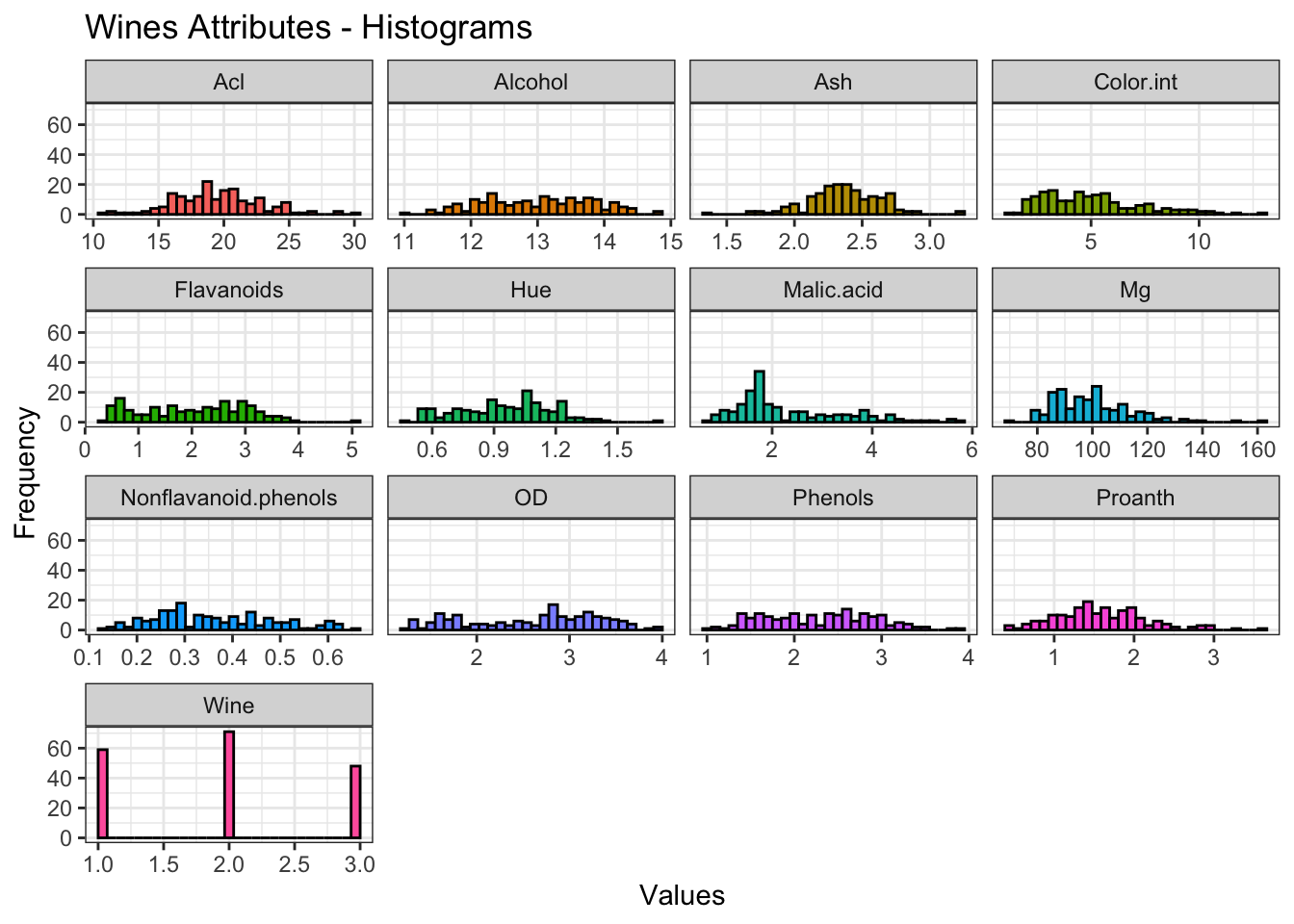
# Density plot for each Attribute
wines %>%
  gather(Attributes, value, 1:13) %>%
  ggplot(aes(x=value, fill=Attributes)) +
  geom_density(colour="black", alpha=0.5, show.legend=FALSE) +
  facet_wrap(~Attributes, scales="free_x") +
  labs(x="Values", y="Density",
       title="Wines Attributes - Density plots") +
  theme_bw()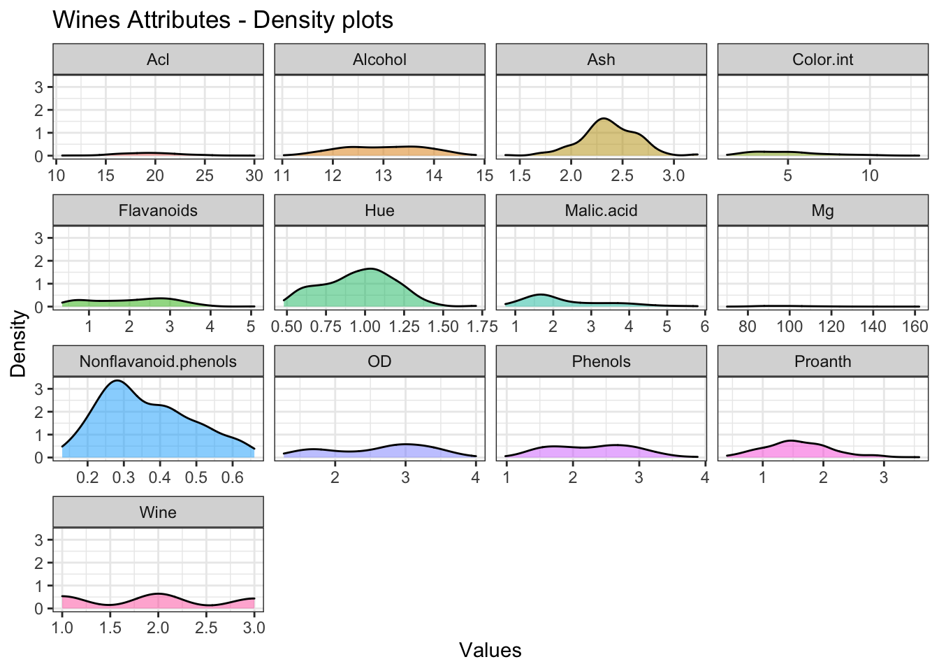
# Boxplot for each Attribute
wines %>%
  gather(Attributes, values, c(1:4, 6:12)) %>%
  ggplot(aes(x=reorder(Attributes, values, FUN=median), y=values, fill=Attributes)) +
  geom_boxplot(show.legend=FALSE) +
  labs(title="Wines Attributes - Boxplots") +
  theme_bw() +
  theme(axis.title.y=element_blank(),
        axis.title.x=element_blank()) +
  ylim(0, 35) +
  coord_flip()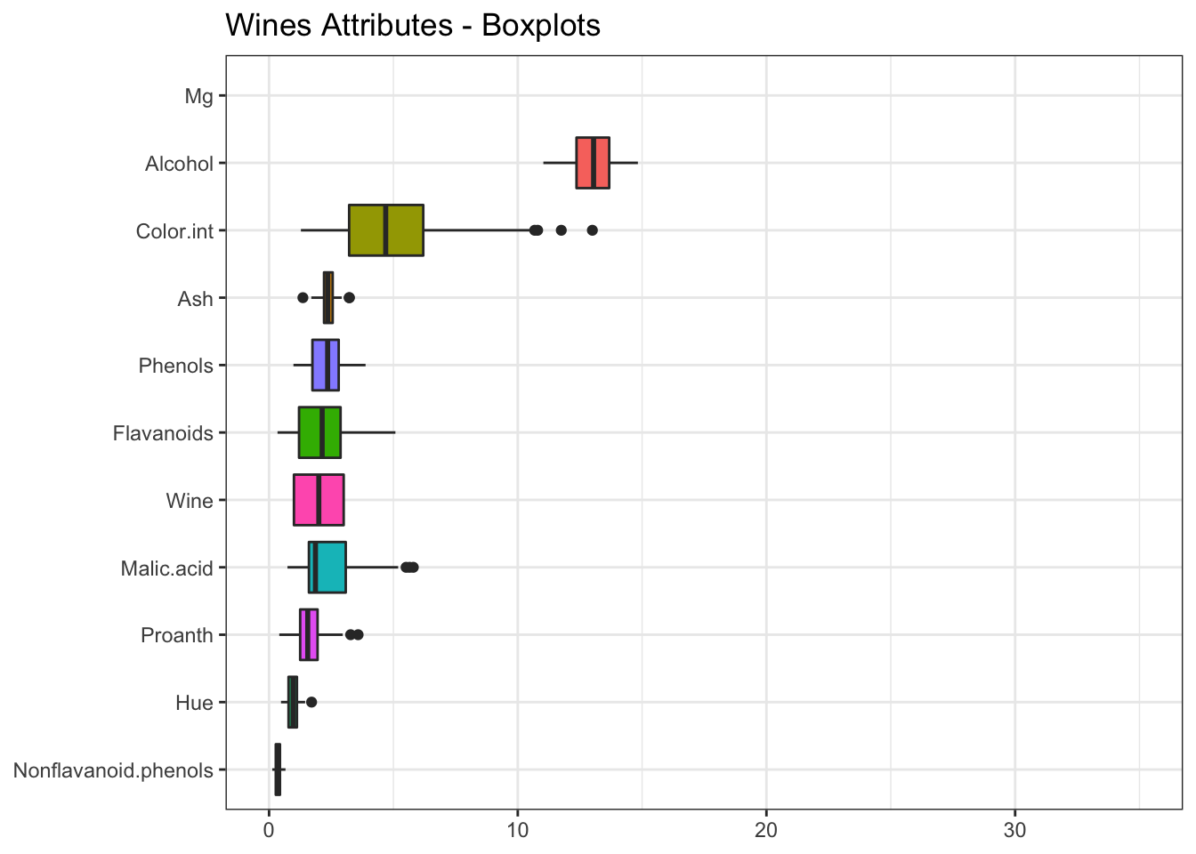
We haven’t included magnesium and proline, since their values are very high and worsen the visualization.
What is the relationship between the different attributes? We can use the corrplot() function to create a graphical display of a correlation matrix.
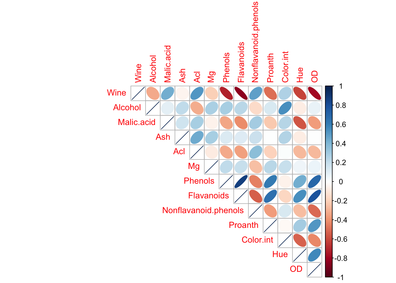
There is a strong linear correlation between Total_Phenols and Flavanoids. We can model the relationship between these two variables by fitting a linear equation.
# Relationship between Phenols and Flavanoids
ggplot(wines, aes(x='Total_Phenols', y='Flavanoids')) +
  geom_point() +
  geom_smooth(method="lm", se=FALSE) +
  labs(title="Wines Attributes",
       subtitle="Relationship between Phenols and Flavanoids") +
  theme_bw()
## `geom_smooth()` using formula 'y ~ x'
Now that we have done a exploratory data analysis, we can prepare the data in order to execute the k-means algorithm.
2.4 Data preparation
We have to normalize the variables to express them in the same range of values. In other words, normalization means adjusting values measured on different scales to a common scale.
# Normalization
winesNorm <- as.data.frame(scale(wines))

# Original data
p1 <- ggplot(wines, aes(x='Alcohol', y='Malic_Acid')) +
  geom_point() +
  labs(title="Original data") +
  theme_bw()

# Normalized data
p2 <- ggplot(winesNorm, aes(x='Alcohol', y='Malic_Acid')) +
  geom_point() +
  labs(title="Normalized data") +
  theme_bw()

# Subplot
grid.arrange(p1, p2, ncol=2)
The points in the normalized data are the same as the original one. The only thing that changes is the scale of the axis.
2.5 k-means execution
In this section we are going to execute the k-means algorithm and analyze the main components that the function returns.
The kmeans() function returns an object of class “kmeans” with information about the partition:
cluster. A vector of integers indicating the cluster to which each point is allocated.centers. A matrix of cluster centers.size. The number of points in each cluster.
##   [1] 1 1 1 1 1 1 1 1 1 1 1 1 1 1 1 1 1 1 1 1 1 1 1 1 1 1 1 1 1 1 1 1 1 1 1 1 1
##  [38] 1 1 1 1 1 1 1 1 1 1 1 1 1 1 1 1 1 1 1 1 1 1 1 2 2 1 1 1 1 1 1 2 1 2 1 1 1
##  [75] 1 1 1 2 1 1 1 1 1 2 1 1 1 1 2 1 2 2 2 1 1 1 1 1 1 1 1 1 1 1 1 2 1 2 1 1 1
## [112] 1 2 1 1 1 1 1 2 1 1 1 2 1 1 1 1 2 1 2 2 2 2 2 2 2 2 2 2 2 2 2 2 2 2 2 2 2
## [149] 2 2 2 2 2 2 2 2 2 2 2 2 2 2 2 2 2 2 2 2 2 2 2 2 2 2 2 2 2 2## Wine Alcohol Malic.acid Ash Acl Mg
## 1 -0.5939424 0.04186090 -0.3811653 -0.1089132 -0.2963363 0.08872942
## 2 1.0325460 -0.07277357 0.6626412 0.1893414 0.5151693 -0.15425269
## Phenols Flavanoids Nonflavanoid.phenols Proanth Color.int Hue
## 1 0.5413132 0.6003536 -0.4806503 0.4107892 -0.3117353 0.5059593
## 2 -0.9410522 -1.0436916 0.8355920 -0.7141412 0.5419399 -0.8795908
## OD
## 1 0.6133643
## 2 -1.0663102## [1] 113 65Additionally, the kmeans() function returns some ratios that let us know how compact is a cluster and how different are several clusters among themselves.
betweenss. The between-cluster sum of squares. In an optimal segmentation, one expects this ratio to be as higher as possible, since we would like to have heterogeneous clusters.withinss. Vector of within-cluster sum of squares, one component per cluster. In an optimal segmentation, one expects this ratio to be as lower as possible for each cluster,since we would like to have homogeneity within the clusters.
tot.withinss. Total within-cluster sum of squares.totss. The total sum of squares.
## [1] 739.565## [1] 1039.824 521.611## [1] 1561.435## [1] 23012.6 How many clusters?
To study graphically which value of k gives us the best partition, we can plot betweenss and tot.withinss vs Choice of k.
bss <- numeric()
wss <- numeric()

# Run the algorithm for different values of k
set.seed(1234)

for(i in 1:10){

  # For each k, calculate betweenss and tot.withinss
  bss[i] <- kmeans(winesNorm, centers=i)$betweenss
  wss[i] <- kmeans(winesNorm, centers=i)$tot.withinss

}

# Between-cluster sum of squares vs Choice of k
p3 <- qplot(1:10, bss, geom=c("point", "line"),
            xlab="Number of clusters", ylab="Between-cluster sum of squares") +
  scale_x_continuous(breaks=seq(0, 10, 1)) +
  theme_bw()

# Total within-cluster sum of squares vs Choice of k
p4 <- qplot(1:10, wss, geom=c("point", "line"),
            xlab="Number of clusters", ylab="Total within-cluster sum of squares") +
  scale_x_continuous(breaks=seq(0, 10, 1)) +
  theme_bw()

# Subplot
grid.arrange(p3, p4, ncol=2)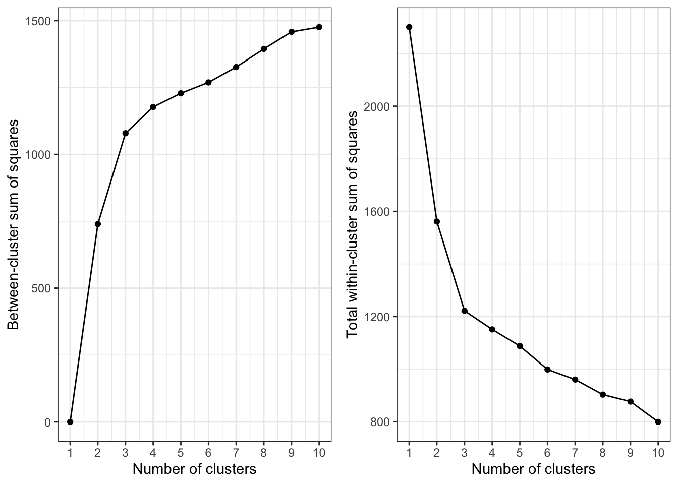
Which is the optimal value for k? One should choose a number of clusters so that adding another cluster doesn’t give much better partition of the data. At some point the gain will drop, giving an angle in the graph (elbow criterion).
The number of clusters is chosen at this point. In our case, it is clear that 3 is the appropriate value for k.
2.7 Results
# Execution of k-means with k=3
set.seed(1234)

wines_k3 <- kmeans(winesNorm, centers=3)

# Mean values of each cluster
aggregate(wines, by=list(wines_k3$cluster), mean)
## Group.1 Wine Alcohol Malic.acid Ash Acl Mg Phenols
## 1 1 1.065574 13.69590 2.002623 2.480984 17.62623 108.00000 2.863934
## 2 2 1.970588 12.26809 1.909265 2.214706 19.77059 92.85294 2.229412
## 3 3 2.979592 13.15163 3.344490 2.434694 21.43878 99.02041 1.678163
## Flavanoids Nonflavanoid.phenols Proanth Color.int Hue OD
## 1 3.0201639 0.2913115 1.939672 5.472951 1.0691803 3.177541
## 2 2.0276471 0.3610294 1.586324 3.039265 1.0528824 2.768088
## 3 0.7979592 0.4508163 1.163061 7.343265 0.6859184 1.690204# Clustering
ggpairs(cbind(wines, Cluster=as.factor(wines_k3$cluster)),
columns=1:6, aes(colour=Cluster, alpha=0.5),
lower=list(continuous="points"),
upper=list(continuous="blank"),
axisLabels="none", switch="both") +
theme_bw()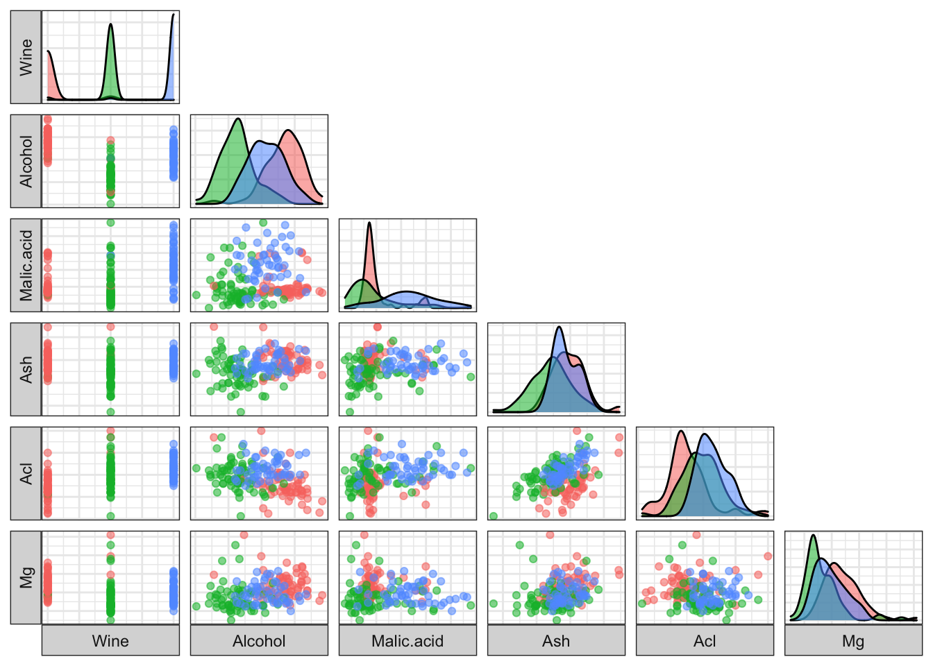
2.8 Summary
In this entry we have learned about the k-means algorithm, including the data normalization before we execute it, the choice of the optimal number of clusters (elbow criterion) and the visualization of the clustering.
It has been a pleasure to make this post, I have learned a lot! Thank you for reading and if you like it, please upvote it.
2.9 Citations for used packages
Dua, D. and Karra Taniskidou, E. (2017). UCI Machine Learning Repository [http://archive.ics.uci.edu/ml]. Irvine, CA: University of California, School of Information and Computer Science.
Hadley Wickham (2017). tidyverse: Easily Install and Load the ‘Tidyverse’. R package version 1.2.1. https://CRAN.R-project.org/package=tidyverse
Taiyun Wei and Viliam Simko (2017). R package “corrplot”: Visualization of a Correlation Matrix (Version 0.84). Available from https://github.com/taiyun/corrplot
Baptiste Auguie (2017). gridExtra: Miscellaneous Functions for “Grid” Graphics. R package version 2.3. https://CRAN.R-project.org/package=gridExtra
Barret Schloerke, Jason Crowley, Di Cook, Francois Briatte, Moritz Marbach, Edwin Thoen, Amos Elberg and Joseph Larmarange (2017). GGally: Extension to ‘ggplot2’. R package version 1.3.2. https://CRAN.R-project.org/package=GGally
Yihui Xie (2018). knitr: A General-Purpose Package for Dynamic Report Generation in R. R package version 1.20.
Yihui Xie (2015) Dynamic Documents with R and knitr. 2nd edition. Chapman and Hall/CRC. ISBN 978-1498716963
Yihui Xie (2014) knitr: A Comprehensive Tool for Reproducible Research in R. In Victoria Stodden, Friedrich Leisch and Roger D. Peng, editors, Implementing Reproducible Computational Research. Chapman and Hall/CRC. ISBN 978-1466561595